


Slo Food Market produces a growing range of in-house goods, but lacked a cohesive system for presenting them on shelf. Each product existed independently, without a unified visual language to support brand recognition or scalability.
SLO JAMS was designed as a modular packaging system—one that could unify the product line, improve shelf presence, and scale effortlessly as new flavors and categories are introduced.
In-house products at Slo Food Market faced several challenges:
The goal was not just to redesign a label, but to create a repeatable system that balanced brand presence, clarity, and production efficiency.
The solution focused on creating a highly structured, minimal system that could be reused across all products without sacrificing individuality.
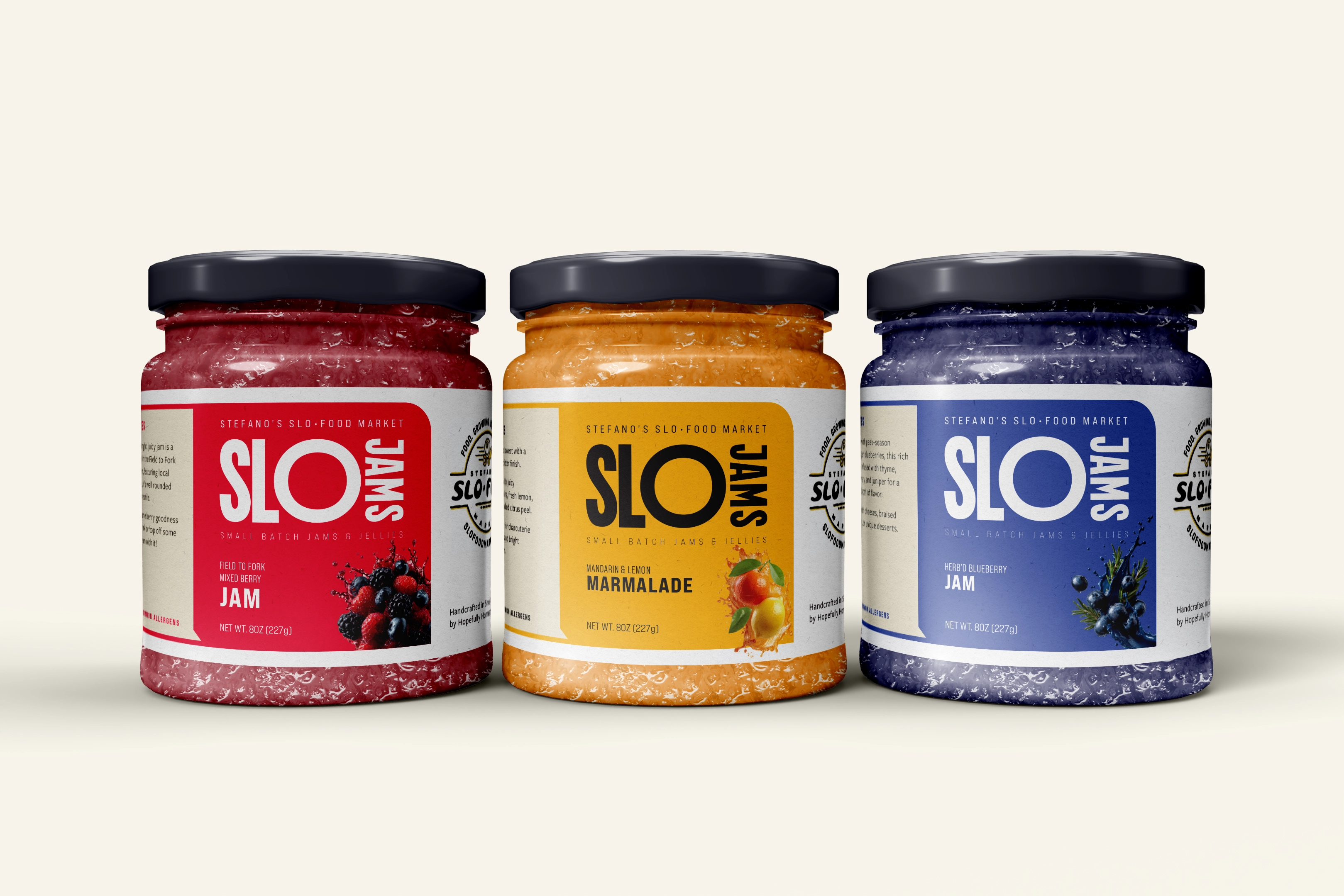
“SLO” becomes the dominant visual element, establishing immediate recognition and acting as the core identifier across all SKUs.
Each flavor is assigned a distinct color, allowing customers to quickly scan and differentiate products at a glance while creating strong visual blocking on shelf.
The layout prioritizes:
This ensures readability from a distance while maintaining clarity up close.
The system is designed to be reused with minimal adjustments:
The label system is built on a consistent grid and typographic structure, allowing each variation to feel unified while remaining distinct.
The result is a system that feels modern, confident, and highly functional.
When applied across multiple SKUs, the labels function as a cohesive visual system rather than individual products.
On shelf, this creates:
Each jar stands on its own, but together they create a more impactful retail experience.
The SLO JAMS system establishes a foundation for Slo Food Market’s in-house product line moving forward.
Beyond jams, the system is designed to extend across additional categories—allowing Slo Food Market to build a cohesive private label ecosystem over time.
The system is intentionally flexible and can be adapted for:
By maintaining the same structural foundation, new product lines can be introduced without redesigning from scratch—ensuring long-term consistency and efficiency.